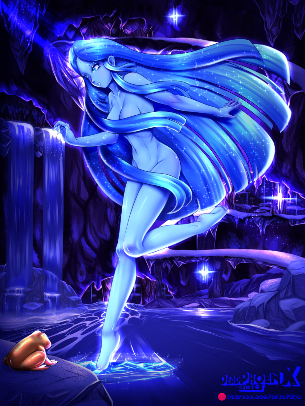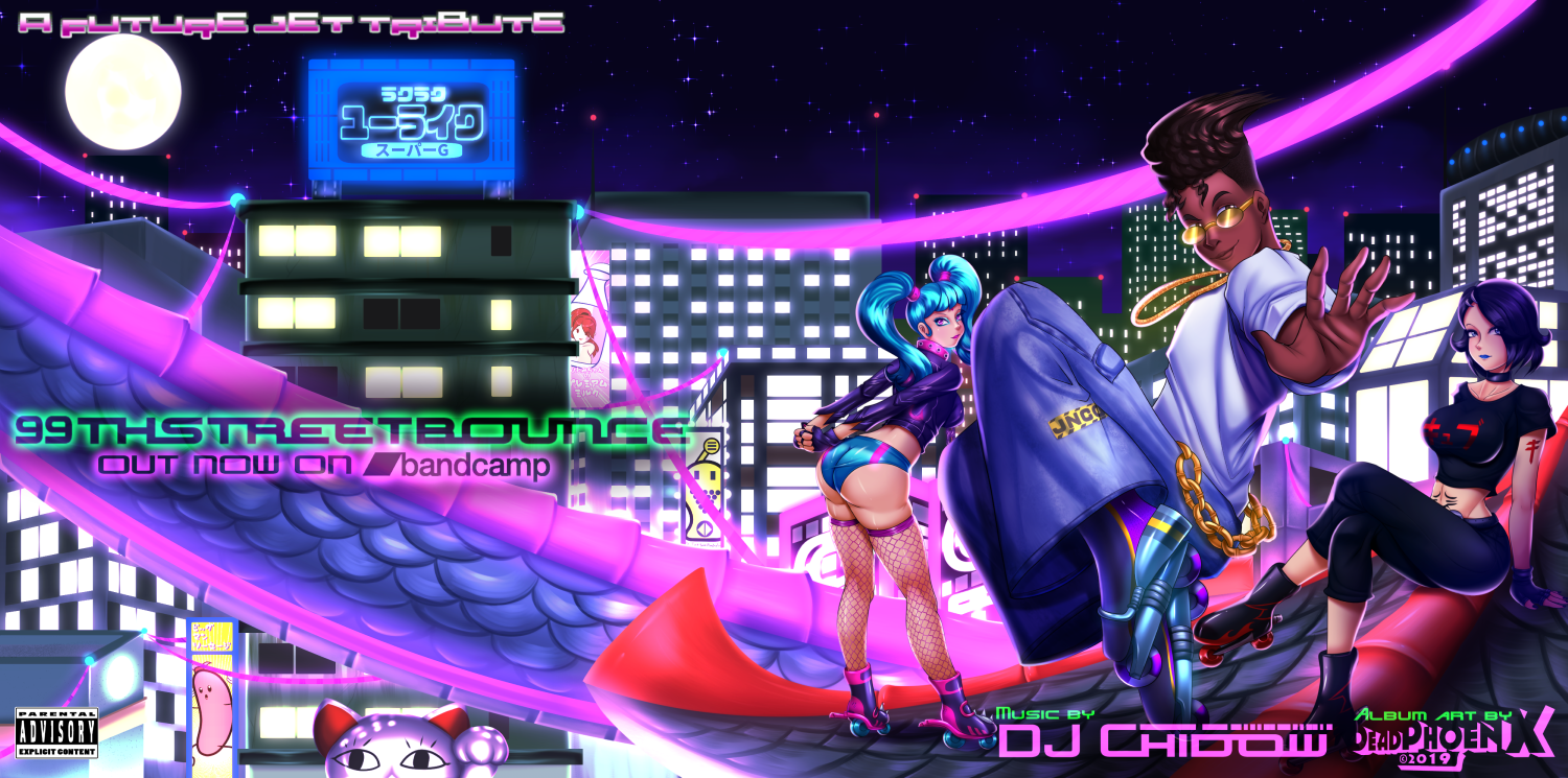
When I opened up this gallery back in 2016, I did so in the hopes of being able to post whatever kinds of artwork I wanted wihout the restraints seen on sites like DeviantArt (No XXX content) and Pixiv (censored genetalia). And for the most part, I was able to achieve just that. Even though my DA, Pixiv, and Newgrounds galleries have certainly seen more traction than the Blue Fish Apartment, this was always my fallback site should anything happen on one of the others. Look no further than my Harriette pic from 2017 when it was removed by DeviantArt admins. It was gone from there, you needed an account to view it on Pixiv. And yet you could still view it here.
But like with many apartments, after some time you start to see the cracks in the walls that the landlords tried to hide when they gave you the tour. In the case of FC2, those cracks became hard to ignore. Chief among them being the server and how dreadfully weak it would become if more than 10 people (yes, TEN PEOPLE) tried to visit this gallery at the same time. Images wouldn't load, or the pages would just return a 404. It was horrible. I can't help but think that this weakness may have been a contributing factor when I submitted my application to AnimeNYC's Artist Alley last year. Of course there were thousands of other applicants besides me. But knowing that, things have to be snappy, otherwise you're on the Waitlist. Support for the English version of FC2 is incredibly sparse compared to the Japanese version, with the JP version getting new updates and events every so often, while the English version remains stuck in 2012.
Another issue was the filesize limit. Too often I'd encounter images that would squeak just above the 2MB threshold that FC2 allows for images. Yes, 2 MEGABYTES. This was the first hurdle that I just had to accept when I opened this gallery. However the system here is very strict. If I go even a single kilobyte over 2MB, then I'd have to go back to the image and lop off about 100px to get it within range. It was a proper pain in the ass if you asked me. The next issue was FC2's rather overzealous filters for words. I'm guessing the Japanese side of FC2 wanted to clamp down on certain communities by way of filters. However even the most benign of words would be dinged by the filter, making my post un-unpuiblishable until I changed the word. This also made my Commission's page a minefield if I wanted to go back and add something to the ban list since a word that was once allowed before might get dinged. That's why you see me linking to another gallery's commission's page in this regard.
The next issue is a matter of content. From the beginning I knew that I would need to put up some kind of Age Gate. No matter how you slice it, if you're an NSFW artist, it's the responsible thing to to. The issue is that... FC2's is kinda trash. It doesn't really work... AT ALL, and only really kicks in if either you're in Japan, or I set the backend to Japanese. Otherwise, there's no way to stop the BIG DANG TIDDY from being the first image that pops up if it happens to be the most recent pic I finished. I created the "Clean" and "R-18" buttons up top to mitigate this a bit. But deep down it was like trying to cover a boob with a toothpick. The new site finally has a proper Age Gate, and I can better control the viewing experience, especially for those at work who want to avoid a permanent vacation at home (unless you've been doing that for these past few months, just without the Zoom calls and more heavy drinking). So if I'm gonna tiddy, I gotta do it responsibly.
And finally, this last part errs more on the side of scope and convenience. There's things that I've been wanting to do to modernize the look of the gallery, making things better to look at presentation-wise, while making it more convenient for me to post without having to jump through very monotonous hoops. It's no secret that between the 3 English galleries (BFA, DeviantArt, and Newgrounds), I copy-paste the description. This gets very tediious to do as I have to format each site's description according to their systems. What's tedious is the Social links that I have to put on the top and bottom and in different formats. What also kinda blows is how lame the Patron mentions are at the bottom of the description. It's just a couple of lines and that's it, when it should be more of a big deal. So If there's one place I could make this easier and improve upon it, it's on Blue Fish Apartment. So on the new site, I've built it in such a way that the Artwork posts already have the Socials plugged in all the time without any further input on my end. Plus I can finally put in a Patrons box for any new Patrons for the month right under the artwork for easier visibility.
For the few people that visited this gallery on FC2, I would like to give you my thanks for coming over to this gallery. I'd especially like to thank the people on Paheal who'd link to this site when posting my artwork on there. If this site crashed, my bad, But as you can see it's not my fault. But now I have to leave this old apartment behind.for a new one. Right now there's a Closed Beta for the site happening right now. You'll need a password to get through, and you can only get it by DM'ing me on Twitter, Instagram, or Discord, or catching it on the few Discord servers I hang around nowadays. If you're visiting from the distant, utopian post-corona future of 2021, you should just be able to get in.
For the sake of history, this gallery will remain open and be renamed to Blue Fish Archives, with this very post being the very last post this site will ever see.
With that said, I'll be locking up this door and giving the keys back to the landlord. I'll see you guys over on the new Blue Fish Apartment, artofdpx.com.


