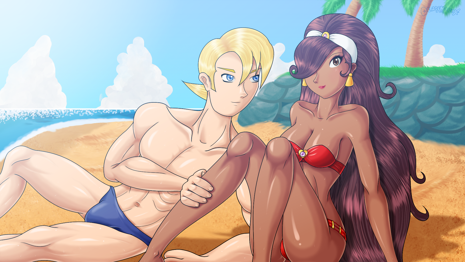
Vacation At Londo Coast

(Below is copy/pasted from DeviantArt, first uploaded on August 25th, 2015)
(Also uploaded to Pixiv as ビーチでエドワード・フォッカとルージュ on August 26th, 2015)
Time for another pic featuring Falcon and Rouge from Power Stone!
Self Critique: Falcon's neck looks a bit long. Also, I pretty much winged it when drawing his left hand (the one on the ground). It looks really poor. Wish I could do something different with his eyes, they look strange to me. I don't have much to say about Rouge other than I wish I could move her nose and mouth a little more to the left.
This was requested by Scorching-Whirlwind.
Okay, so a lot of things had to be learned for this pic. To begin, I was hoping to draw both Falcon and Rouge in the same page much like I did with One Night In Mahdad. But because of the complexity of the pose and the need to line things up right behind Rouge, I had to draw them separately... almost. I left Falcon's right arm to the tablet since I can draw it safely without damaging the other lines. It was relatively easy to draw Rogue. The only issue was her right leg sine the butt part of it mostly disappears behind her left leg. I corrected it via GIMP. One thing I did do, which I started doing to a pic before this one that's going up later, was not use any lineart for the lips. I realized after doing lips so many times, and seeing both a lip tutorial as well as how other people do lips, is that while the lineart would be thin, and because of how I lay down base color, I'd see all these white artifacts behind the lines. You may not see them since the pics I put up here are made smaller, but they distract the hell outta me when I'm working. Plus, some smaller details get eaten up by the lineart.
Onto Falcon, he took up the most work. While some works I've seen him in without his outfit having somewhat of a standard build, look at the dude. Whether watching the anime or playing the game, the dude looks built like a tank. So referring to a private request I did last year, as well as my the trusty posemaniacs.com, I was able to get a good pose for him and well as give him some actual muscle definition. So maybe now I can finally draw something for the ladies in the near future!
The background was more or less back to business in terms of detail, though not as busy as the last FalconxRouge pic. One of the things I did this time was not use too many outlines this time and mostly paint the background. The small rocky hill as pretty simple. I did worry in the beginning, but ones those outlines were applied and rocks shaded, it was a piece of cake. The palm tree I wanted to draw a little more accurately. Back in Mahdad, the tree was more or less cartoony, going based on what I saw in the game's Mahdad stage. This time, The trees looks more ridged and believable. Lastly, I wanted to do something funky with the lighting, something I've been wanting to do for a while. When I played Senran Kagura Burst, I noticed that there was this bluish filter overlayed in the beach stages that made the place look more clean and serene. So I applied it here to see how it looked. I messed around with the color to get it right and not be too bright. In the end, it looked pretty good.
Lastly, while this has nothing to do with the pic itself, changing GIMP's theme to something darker was a godsend for my eyes. Since I do artwork mostly at night with just a lamp on, this big ass screen gets freakin' bright, not to mention that some things are hard to see when I'm decreasing layer sizes and moving things around. You can see the theme in use here. twitter.com/DPX_Artwork/status… (the darker one is the one I'm using now).
Done on GIMP 2.8. Wacom Intuos 4 Tablet used.
Falcon, Rouge, and the Power Stone series (c) Capcom.
Tags: FalconRougePower_StoneCapcomDreamcastパワーストーンルージュカプコンドリームキャスト


