


80s Wii Fit Trainer (NES Version)
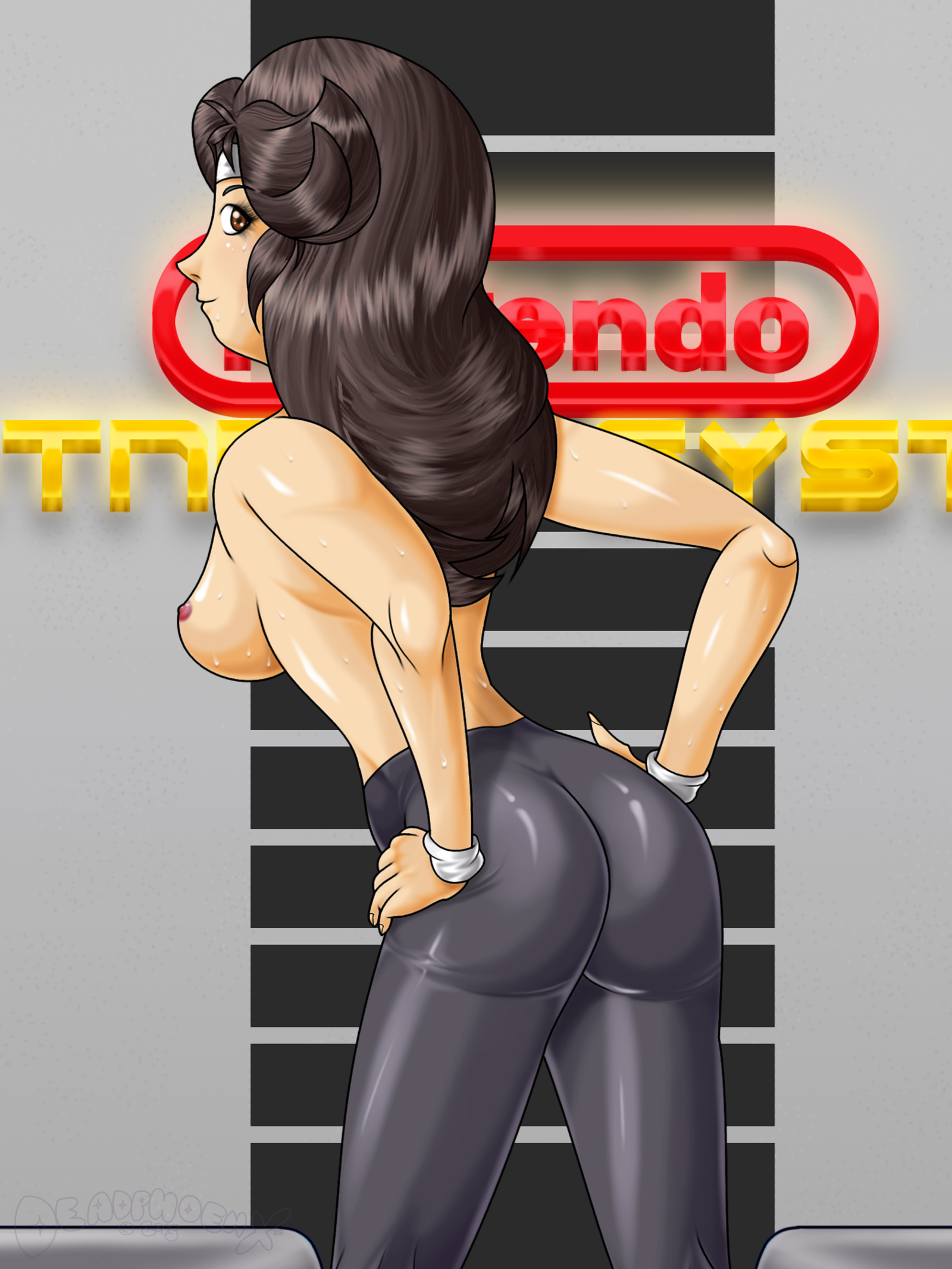
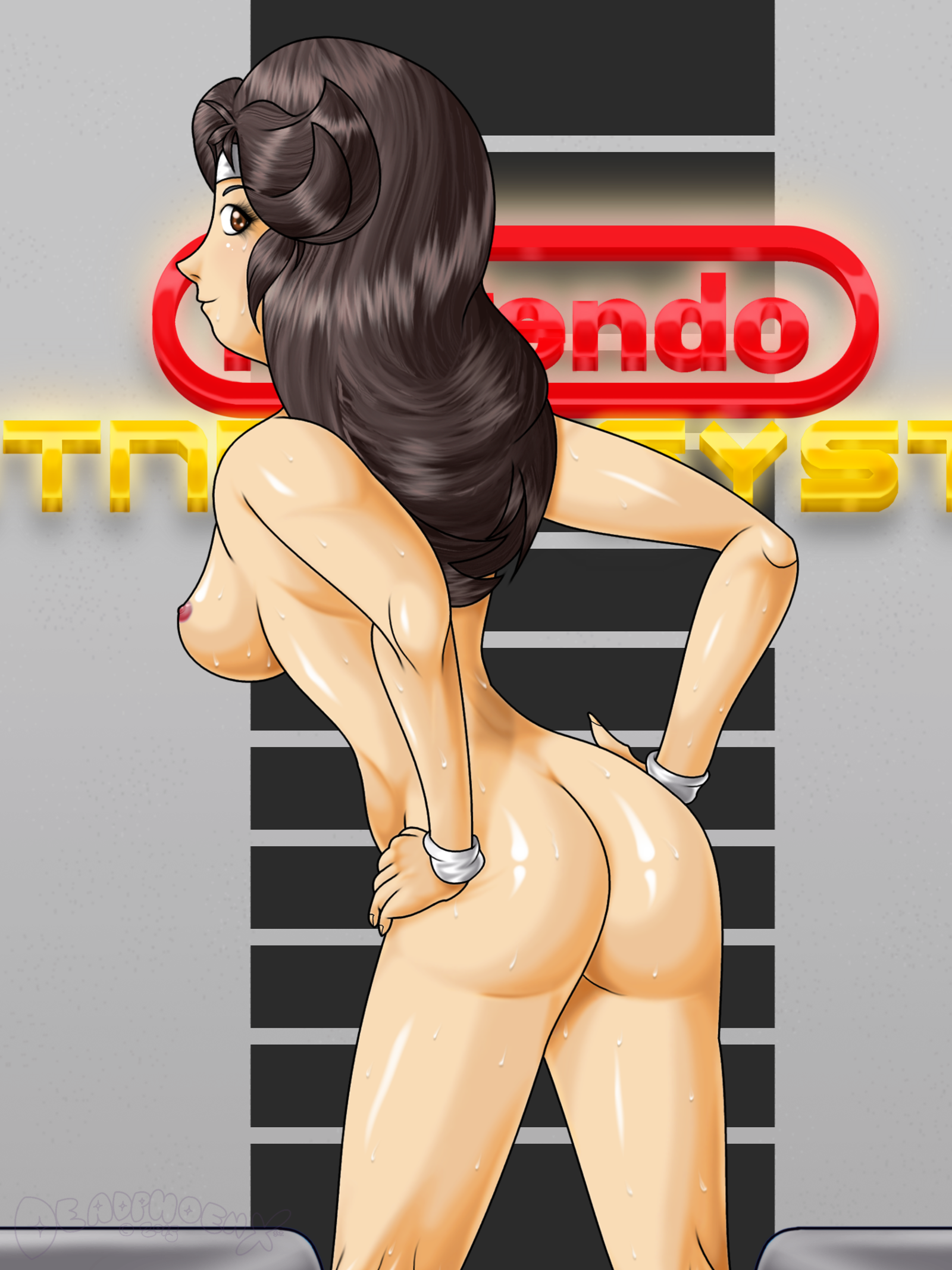
Below this point are R-18 Variants. Proceed at own risk.
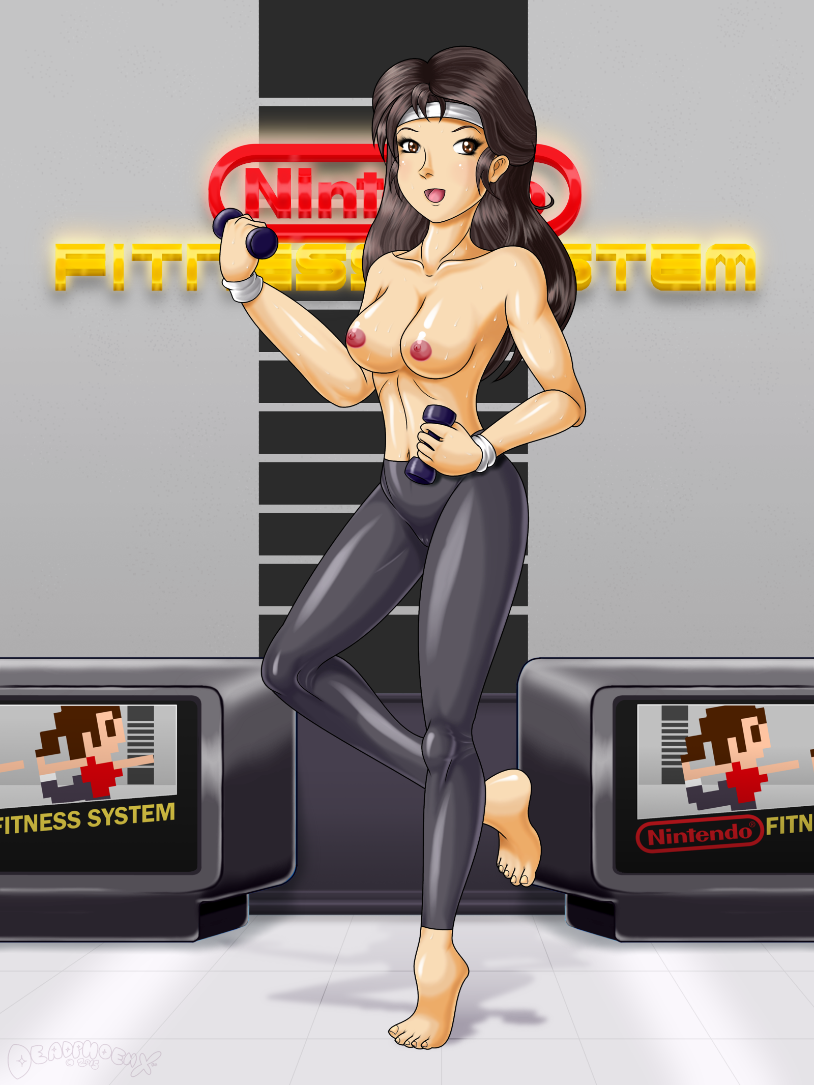
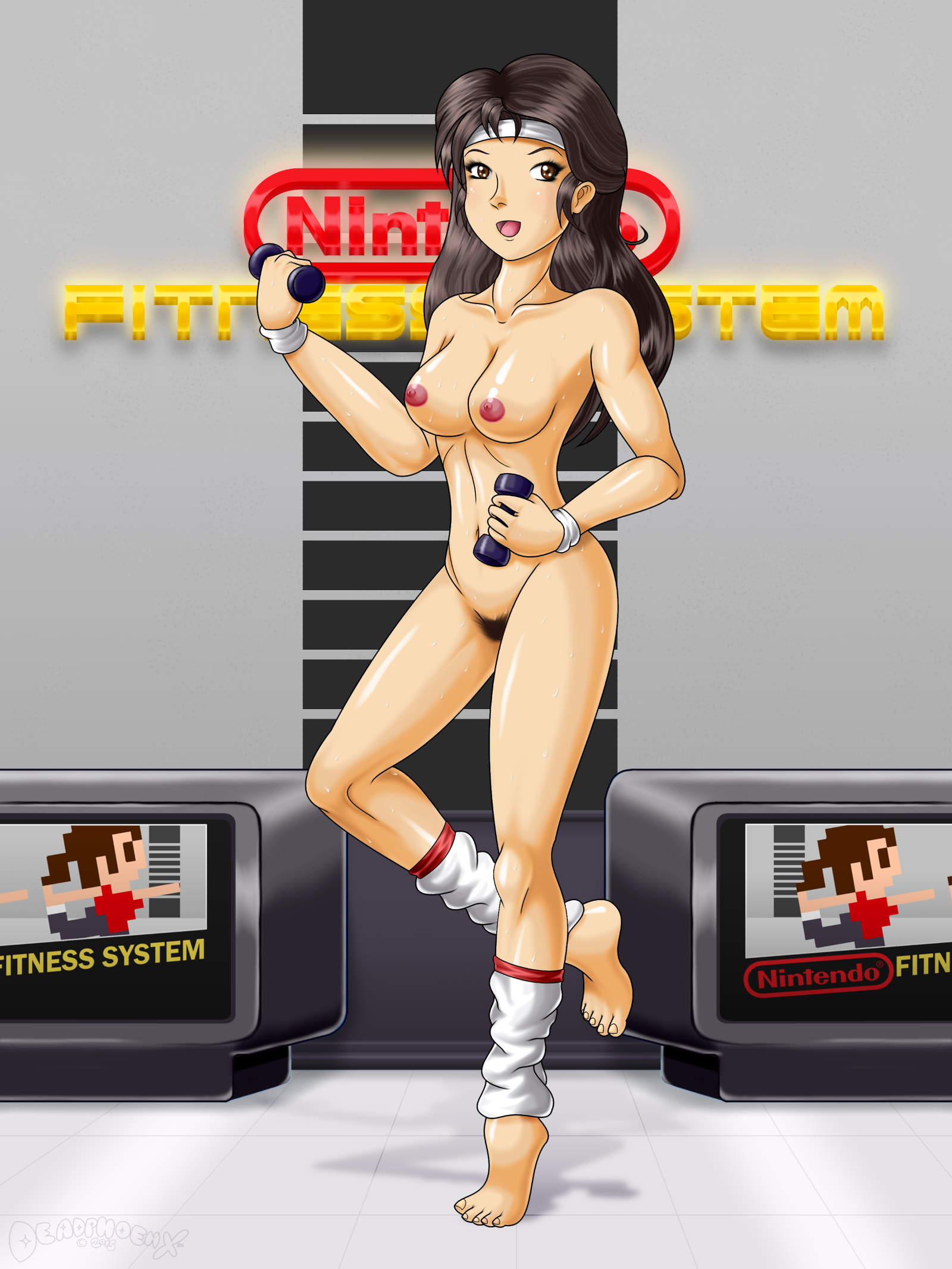

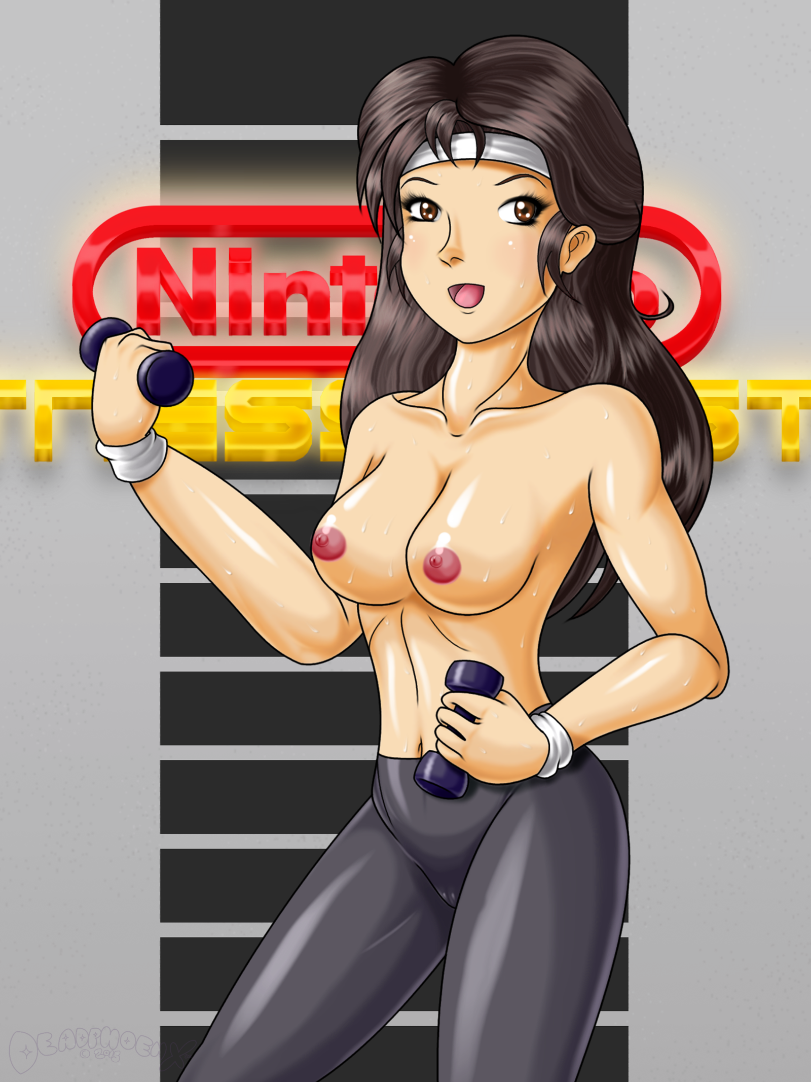
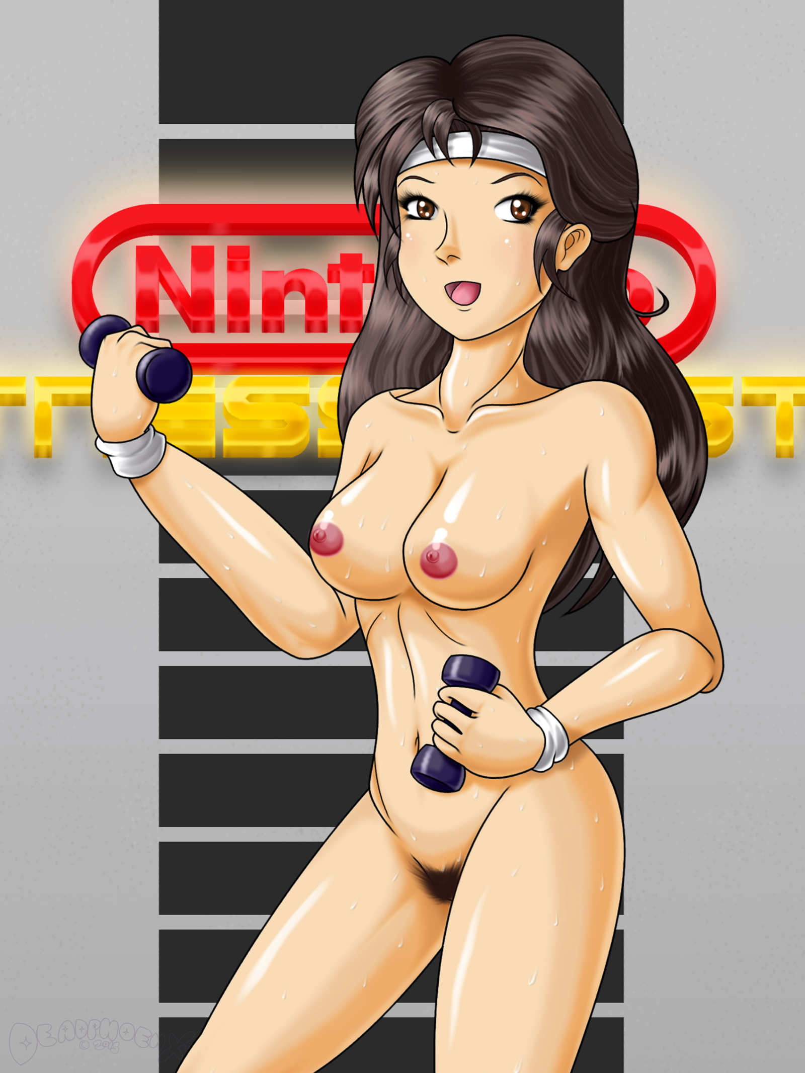
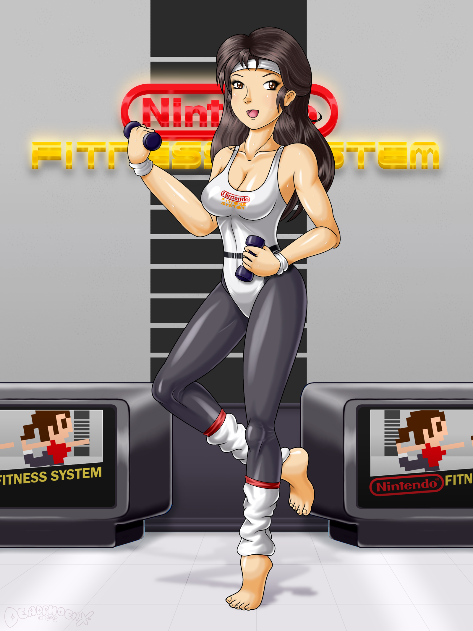
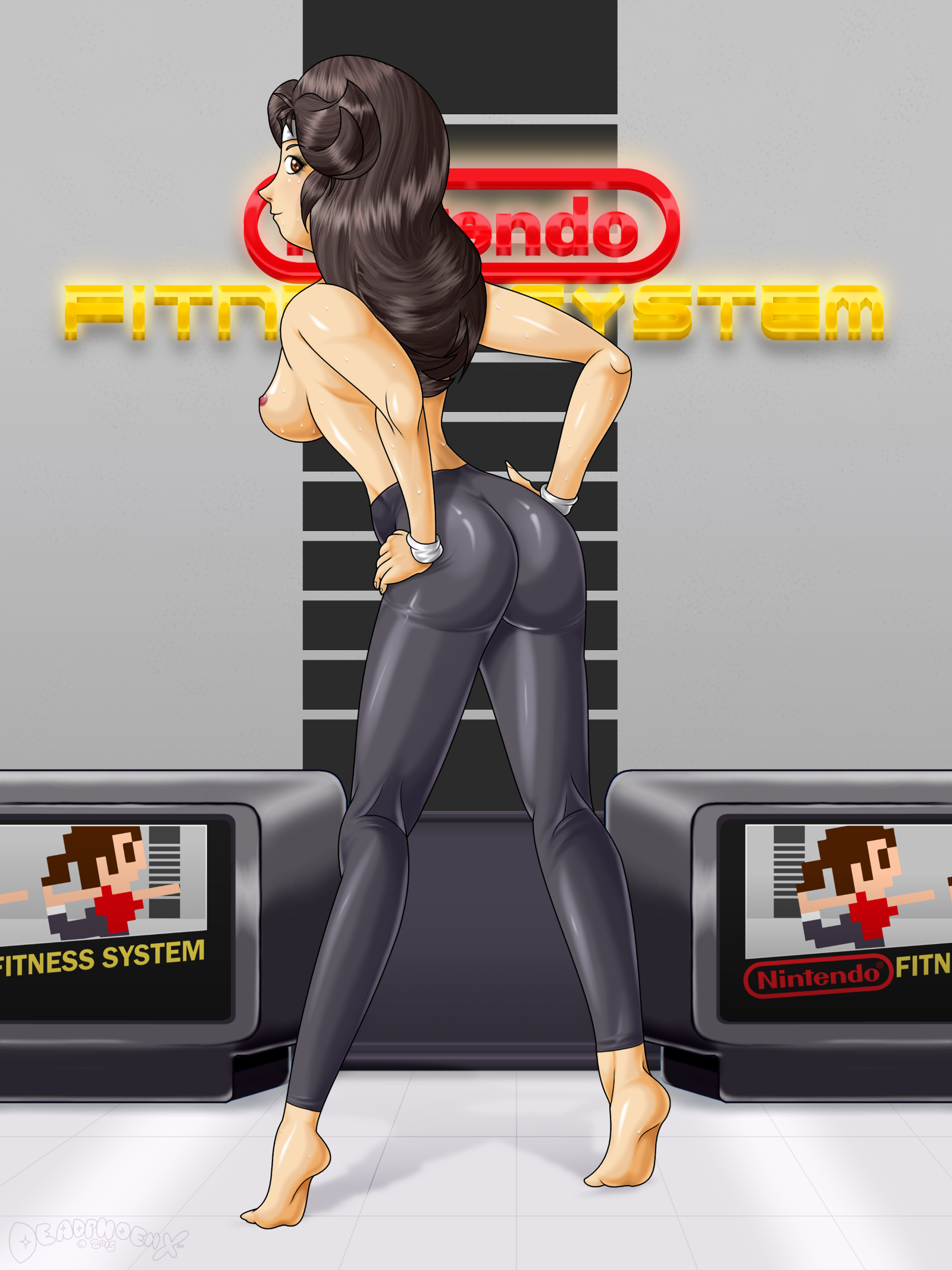
(Below is copy/pasted from DeviantArt, first uploaded on November 29th, 2015 as "Let's Get Fired Up! (NES Version))
Now here's a what-if scenario for ya!
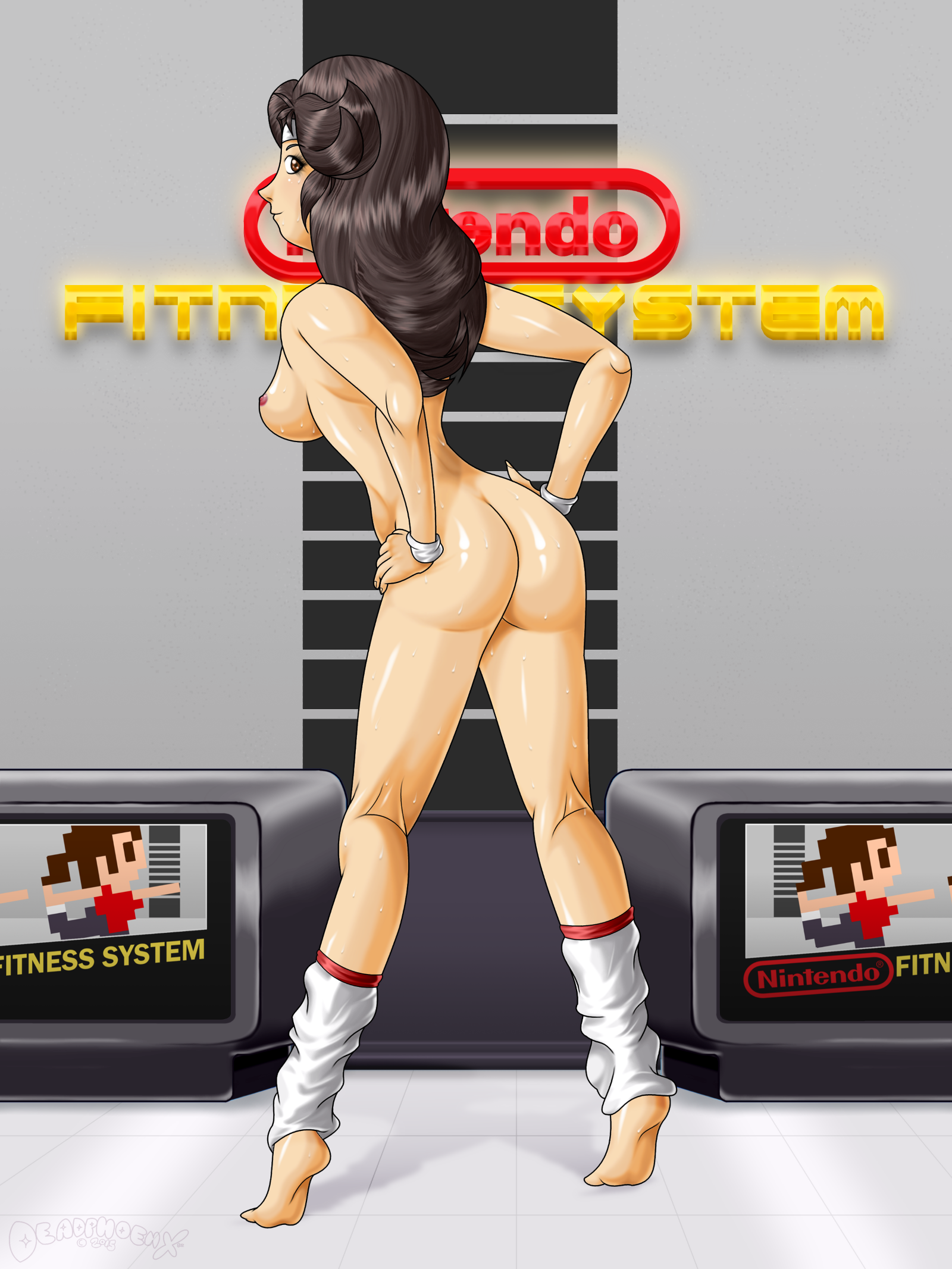
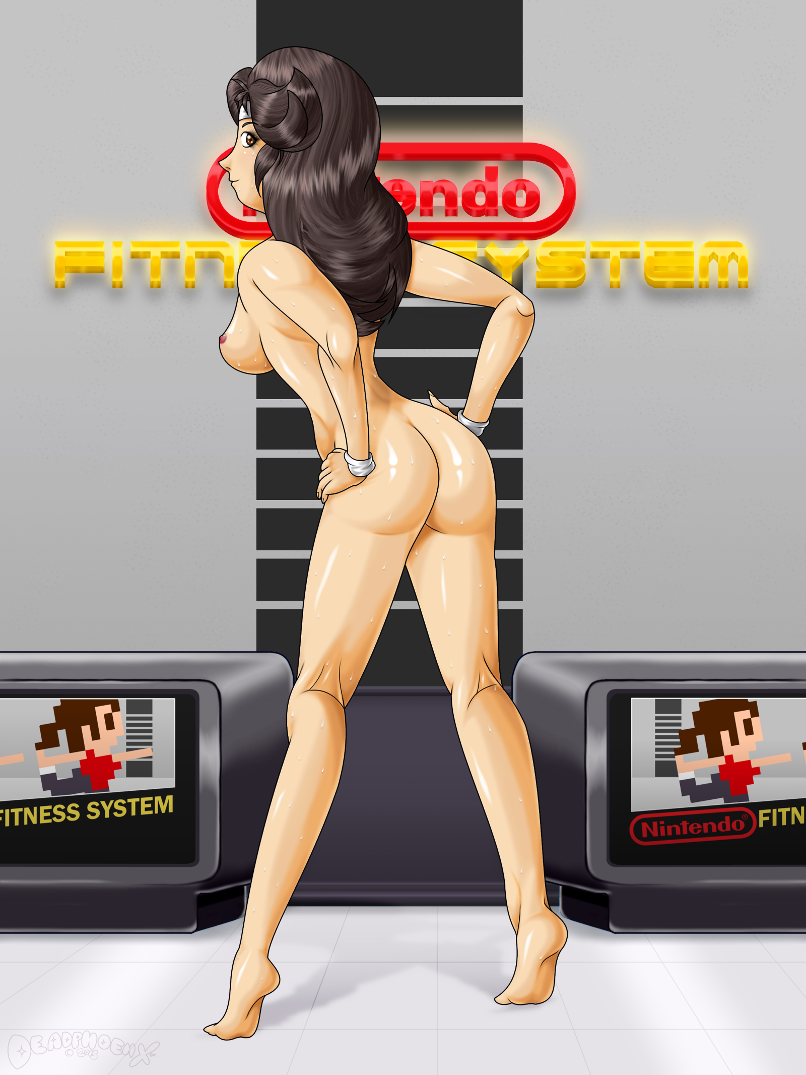
Self Critique: Pretty much all critiques from the Wii version apply here
Addressing: The cart art. It sticks out does it? Notice the mistake? Her leotard is red when it should be white. The moment I noticed this mistake, I had already resized and did everything. At this rate though, I just wanted to be done with this and move on.
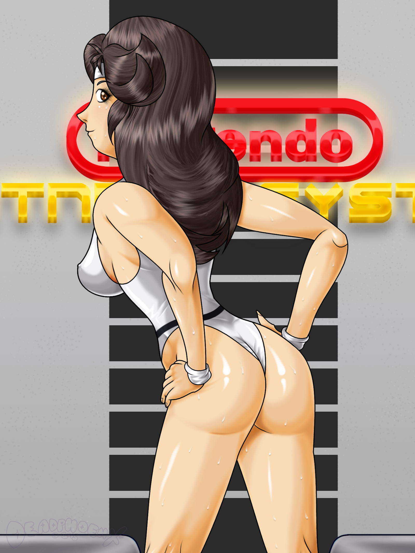
So when conceptualizing doing an 80s era Wii Fit Trainer, I wondered what it would look like if the Trainer herself was around since the NES days, if the idea of "Wii Fit" was an NES game. So I palette swapped her outfit and studio to reflect the era. Out goes Wii Fit, and in come the Nintendo Fitness System. Rather than go overboard and throw in a bunch of NES motifs, I kept it simple, much like her Wii outfit. So her "belt" design is the black strip from the top of the old NES console, and her leotard has the "Nintendo Fitness System" logo on it. Any other NES motifs were relegated to the coloring of her outfit.
For the cart art, I shot for the iconic look of the blackbox pixel artwork of many early NES games made specifically by Nintendo. The cart art was something that I learned to do when making the "Save The Date" cards that I did for my sister's then-upcoming wedding. Going based off that, I went ahead and made the blackbox artwork. I had less real estate to work with, so a few extra things had to be cut off. While we're on the subject, let's talk about the cart shape. Obviously it's not shaped like the NES carts, but more the Famicom carts. It was really a toss-up between which cart I'd be using. In the end, I had to consider the fact that I would also be making a Famicom version for Pixiv, and to make an NES cart would make doing this pic take much longer than it should. So I stuck to the Famicom shape.
You'll also notice that I changed the Trainer's skin color to a normal flesh tone. There's two reasons for this. First, and this was my idea, Nintendo would probably go the normal route of depicting regular people back in the 80s instead of making the stark-white ghosts that we have now. And second, when I checked to see what her stark-white skin would look like with the palette swapped outfits, it looked terrible. So I pretty much made a good call. But man were their so many things to palette swap!
Let's have a little fun. If there really was a Nintendo Fitness System game, which NES-era song do you think the Trainer would workout to? (it could be their originals or remixes, as long as it originally came from the 80s. And it doesn't have to be exclusive to Nintendo-developed games)
Here's my pick: www.youtube.com/watch?v=RnO6t6…
What's yours?
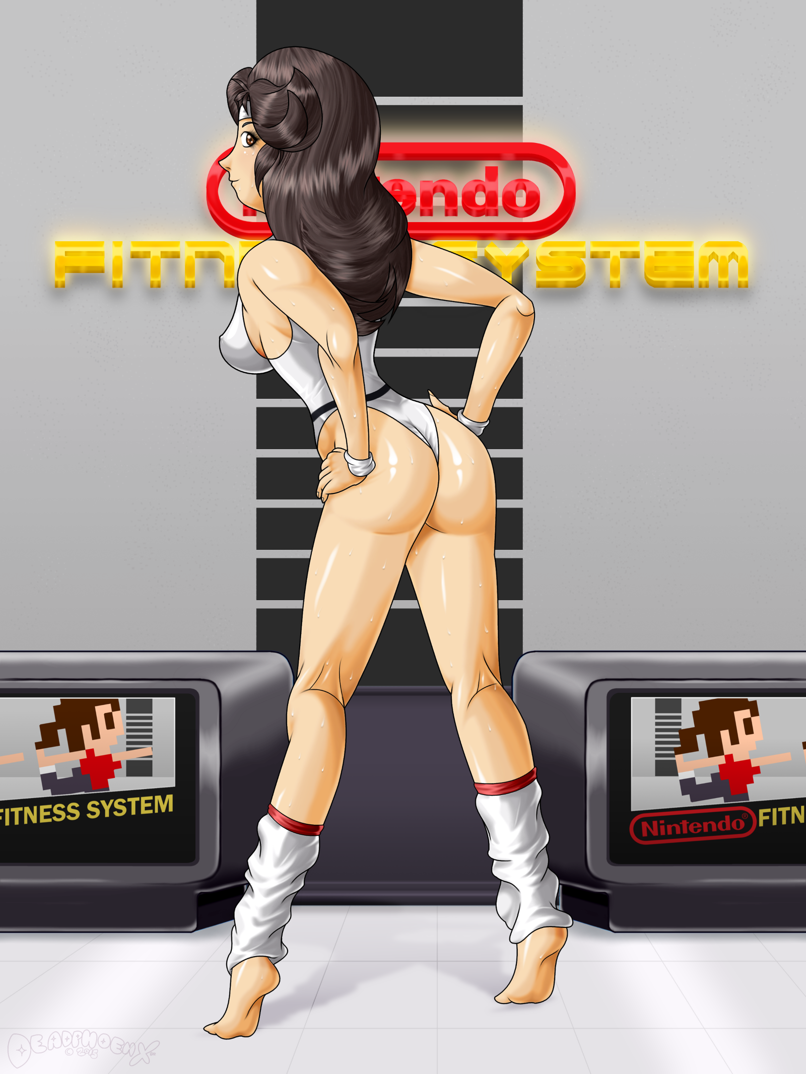
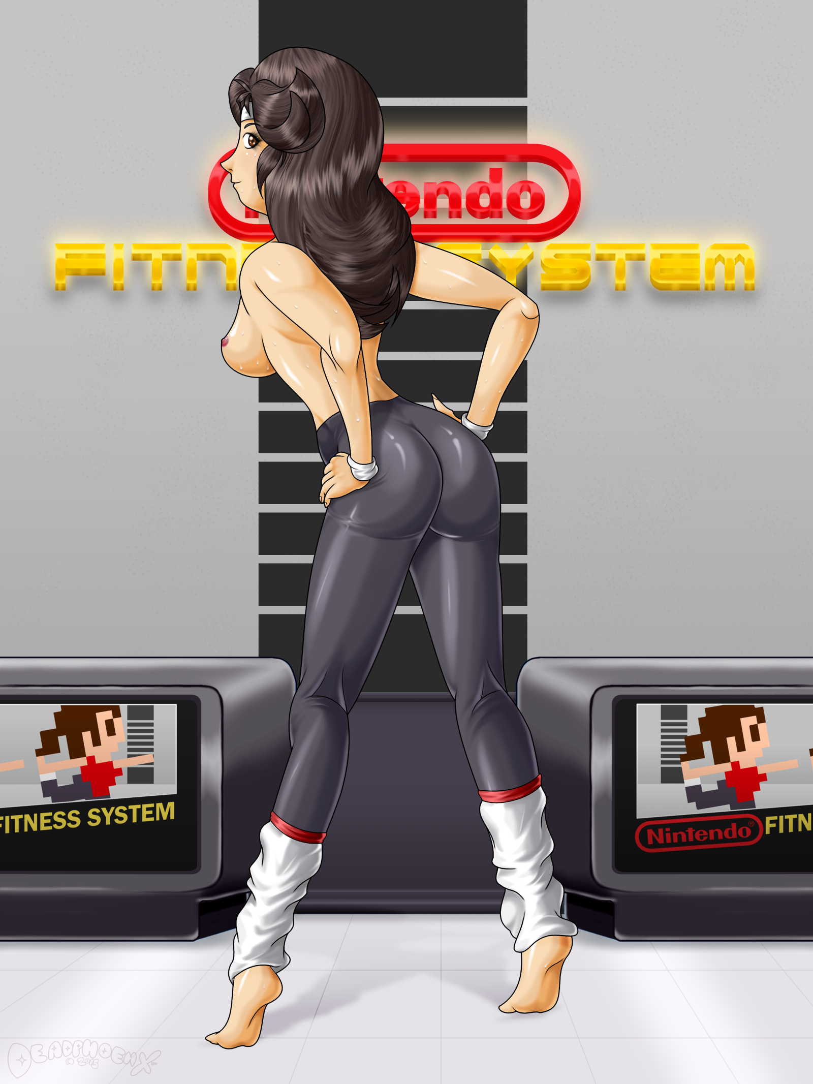
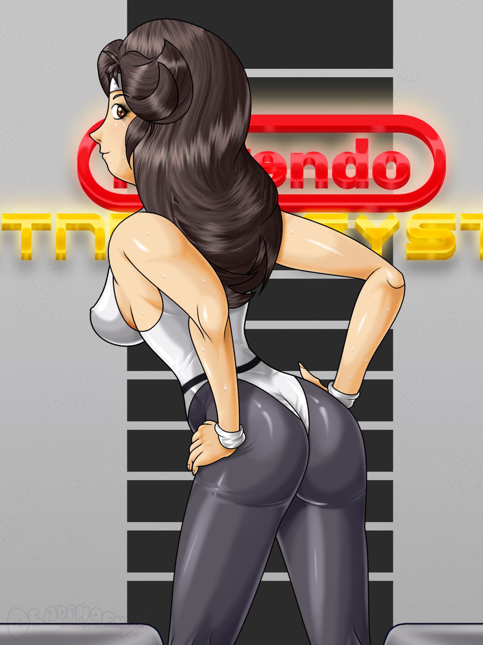
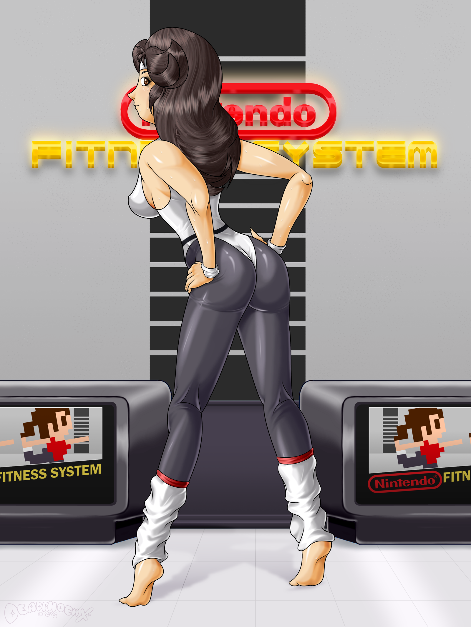
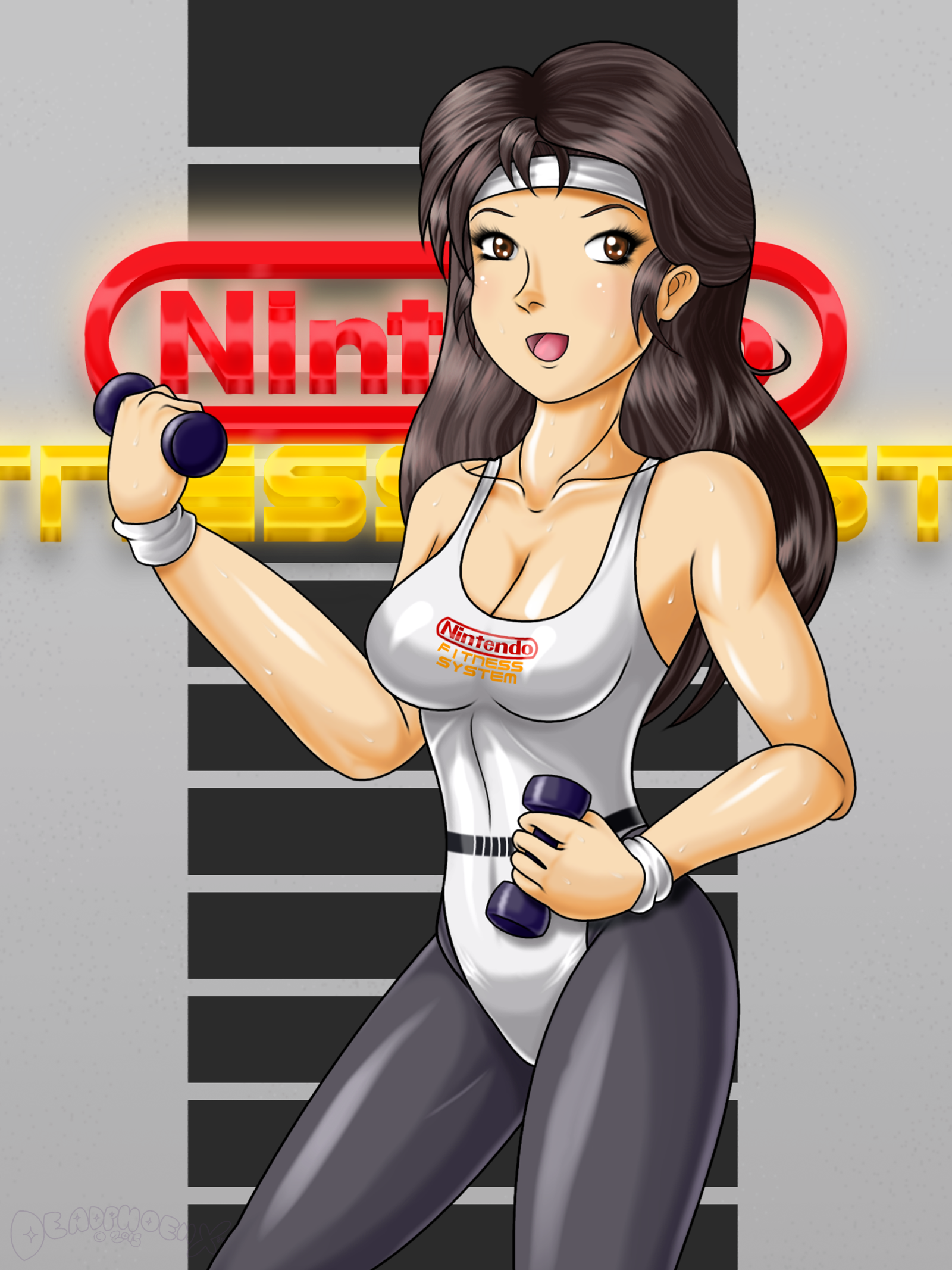
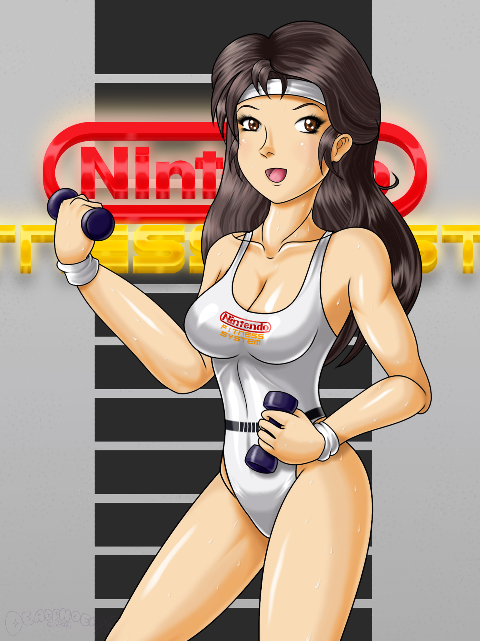
(First uploaded to DeviantArt on December 7th, 2015 as Tuck In Those Glutes (NES Version))
And now for the retro version!
Self critique: All critiques from the Wii version apply here as well.
When making Wii Fit sign on the Wii version, I was thinking about some of those signs you might see in places like fancy office lobbies or yoga studios. Most of the time those signs are made of metal, typically black. In keeping with the Wii color scheme, I made it silver with a sheen and coupled it with the Wii's blue glow reminiscent of the slot light.
When doing the NES version (as well as Pixiv's Famicom version), the process was changed a bit. Instead of a colored light like the Wii sign, it was a standard white light. But this time around it would light up the sign and give it a glow. I contemplated doing neon tube lights, but stuff like that has been done to death already with 80s themes, and many forget that sign styles like these were common too.
There's one more thing I'll reveal now regarding the color choice and placement. The Wii outfit's coloration was directly based on the WFT's standard outfit colors. For the retro outfits, I took to the NES and Famicom systems themselves. The top and bottom of the NES is light gray and dark gray respectively. So I made the outfit Light and dark gray on the top and bottom as well. I did the same to the Famicom version, though I was reluctant at first due to the huge color clash of cream and red. The midsections of the leotards were design after several features of either the system themselves or a graphic design element of the system. For the NES, it was after the black strip on the top of the system. On the Famicom, it was the Pulse Line.
Done on Gimp 2.8. Intuos4 tablet used.
Wii Fit Trainer, Nintendo logo are (c) Nintendo.
Tags: Wii_Fit_TrainerboobsasshairypussyWiiFitトレーナーおっぱい尻陰毛まんこ