Welcome The The Astral Mart! (Conquest of the Crystal Palace HD)
Below this point are R-18 variants. Proceed at own risk.
(Below is copy pasted from DeviantArt, first uploaded on October 5th, 2015)
Also uploaded to Pixiv with R-18 variants as いらしゃいませ~!テンドナルドへようこそ!【魔天童子~りんぷう】 on October 6th, 2015)
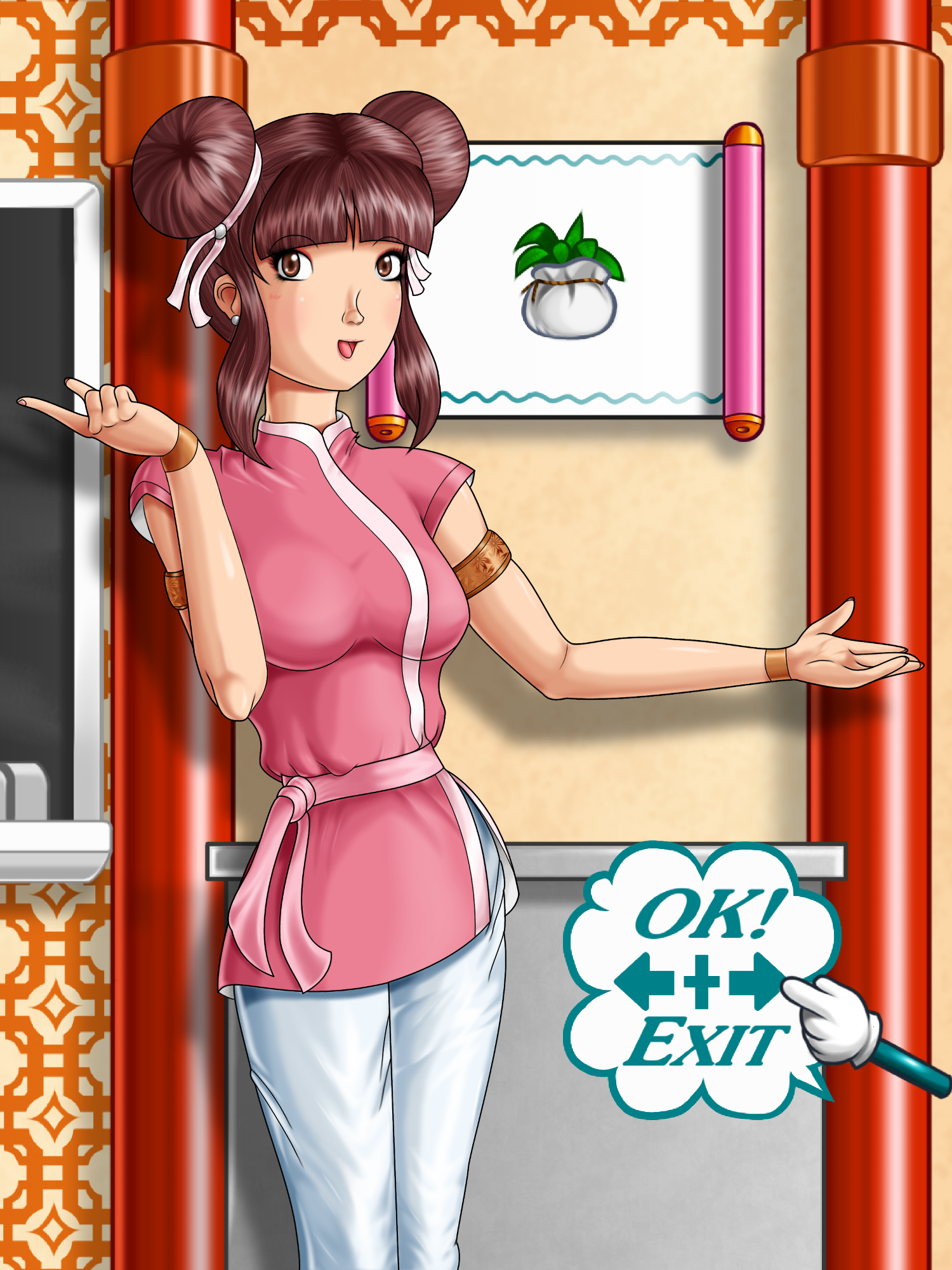
There's barely any fanart of Kim. Time to increase those numbers!
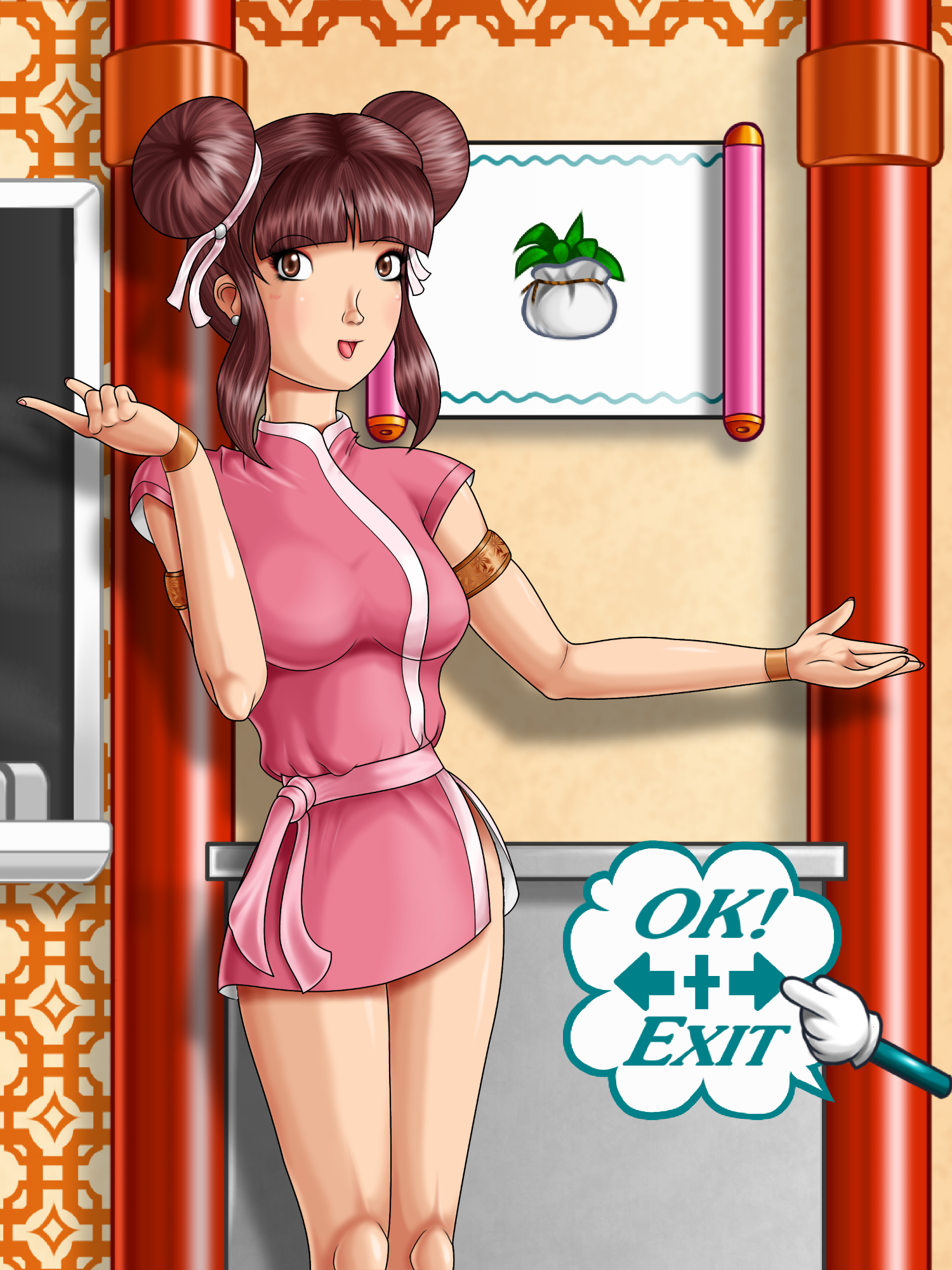
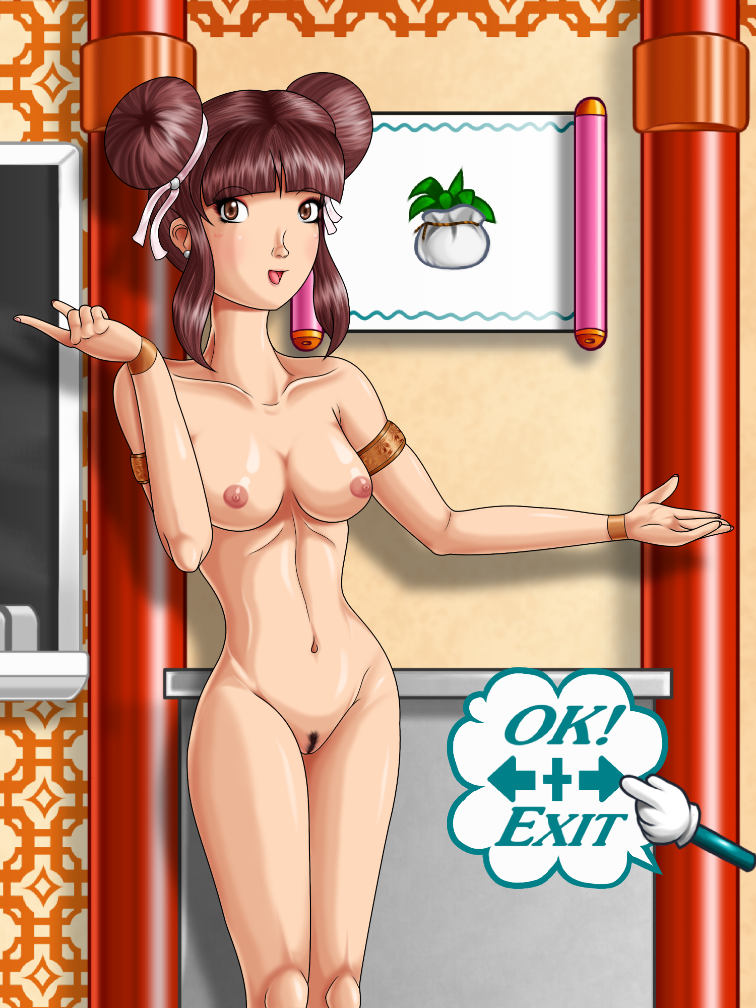
Self Critique: I probably shouldn't have put that one dark line of the left-side elbow. The knot on her waist isn't as intricate as I'd like for it to be. I'll have to study figure hugging, yet loose fitting, clothing if the boobs are any indication.
So I'm doing a small trio series of drawings. The theme: Videogame Shopkeepers! Kim here was actually the second character I drew for the series. I had a somewhat tough time thinking up who exactly to draw, especially since another picture I was doing, the Bombchu Girl from Ocrarina of Time/Majora's Mask, was dropped due to poor quality and planning. I forgot was reminded me to do Kim from Conquest of the Crystal Palace, but I had a eureka moment when it happened. I decided that I'd make NSFW versions of the three shopkeepers I'd draw, so I had to do something to differentiate the different layers of clothing and body. Since I still draw these characters on paper and then scan them for digital inking, drawing, and shading, I figured I'd use color pencils over my normal pencil strokes would do the trick. Well, it worked. Much better too since before there would just be this big mess of lines that would make it hard to discern what was skin and clothing.
I had conflicting references for Kim. There was barely any official art for her, save for the Japanese boxart for Conquest of the Crystal Palace. I needed the reference to know what her pants looked like since in game it's not visible in the Astral Mart, and the sprite is the result of a color limitation. Once I found the Japanese boxart with her on it, that's when the conflicts began. In-game, her hair is a very dark brown, but on the boxart, it's a very light brown. Her pants were white on the boxart, compared to her sprite's pants being pink (again, could be limitations). The gi trim and belt in game was pink, but on the boxart the trim was white and the belt was pink. In-game she didn't wear wristbands, on the boxart she did. Realizing I'm dealing with hardware limitations vs. official art, I went with the official art. Out of every I did on her, I'm most proud of how I did her double bun hairstyle. I did this before over on Pixiv, but not at that angle. I realized I could make a dark spot on the center of the bun and whip it out along the strands to give the bun depth. I also did the hair in multiple independent sections to make the part blend naturally with one another (like the bangs and the rest of her hair). I was thinking of adding a design texture on her gi, but figured keeping it simple would be best. I did add it on her armbands though.
Quick note about the "OK + Exit" bubble down there. I only added it there because the space was looking very empty and the pose was not helping.
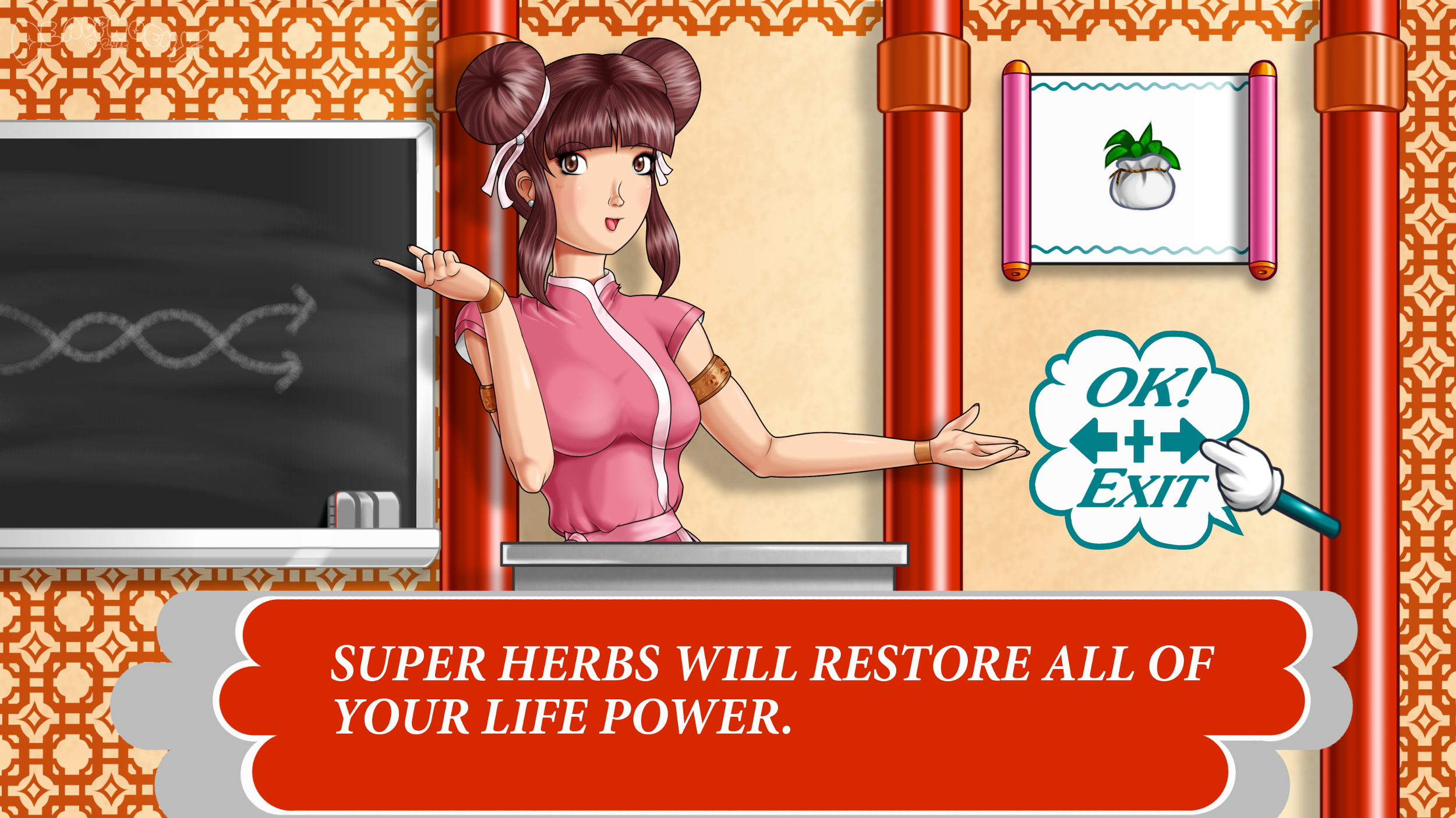
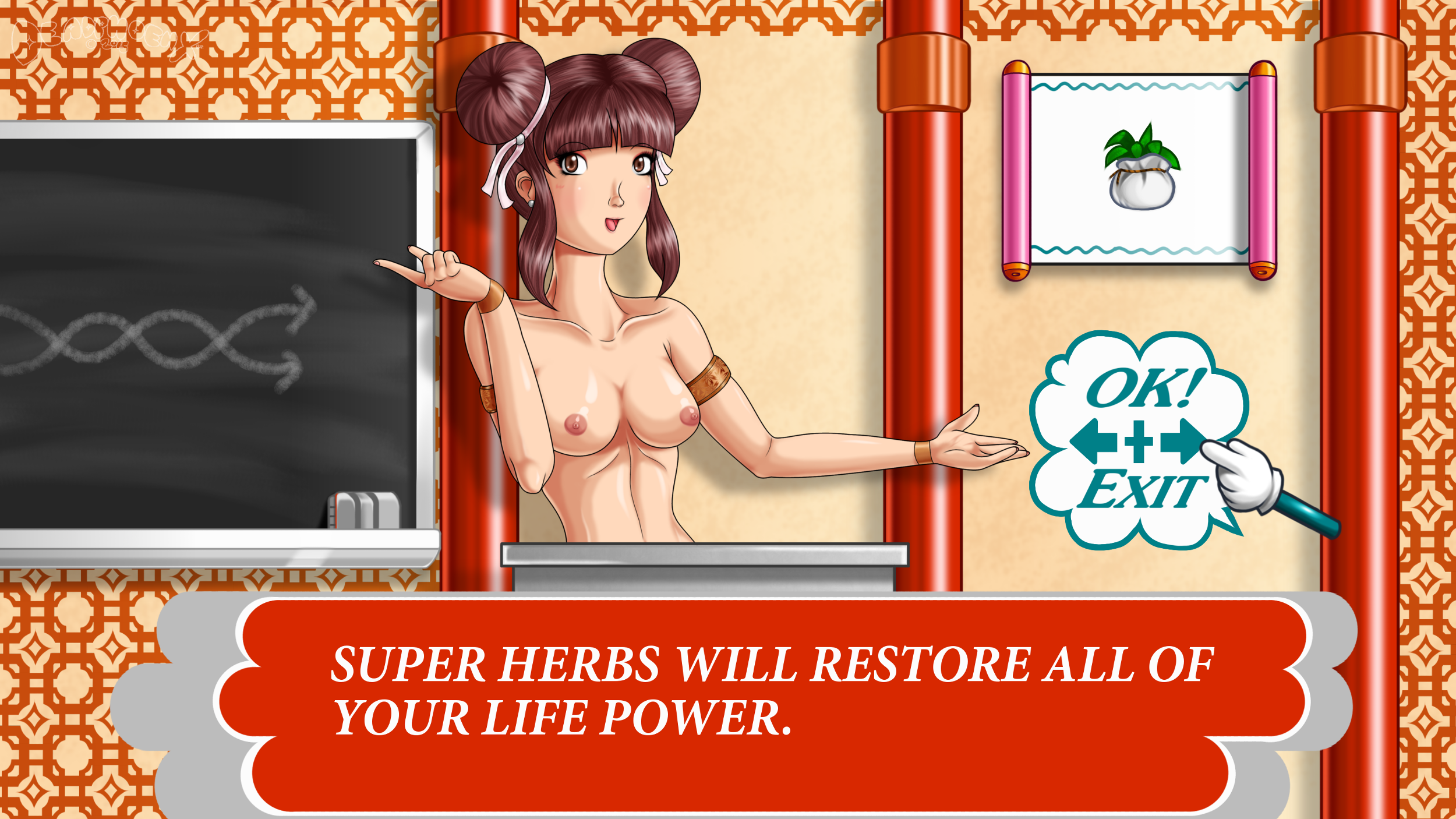
When thinking up what backgrounds to do for each of the shopkeepers, I knew they'd be in there shops. At first I thought that I'll just recreate their shops and put them in front of their counters. But there would be a lot of open space no matter where I put them. So then I thought that I'll just stylize their shopfronts to fit a portrait. It didn't work. Eventually I realized that, for the sake of completeness, I'd have to make two versions, one that showed off their shopfronts, and one with a focus on the characters. But then I went one step further and tried recreating them as if they were HD remakes.
Ever since I did Sailing Through the Sea, I've wanted to dabble even more with painting backgrounds, doing everything almost freehand and little use of lineart. Doing the beam was like a warm up. But the fun began with the chalkboard on the left. I did that one in parts, starting with the eraser, then the plate that holds the eraser, that border of the chalkboard, then the board itself. The scroll on the right was surprisingly somewhat of a challenge, probably because I decided to freehand the undersides of the handles using only a few layers. Once all that was done, the last thing I had to do was the pattern. It looked complicated, but I realized it was just two squares overlapping each other. I did one square first, then the next square. I utilized a copying technique I first did on BladeLadies 2nd where I make one pattern element, then copy that one sever times by duplicating the layer. Then I merge the layers and duplicate the big layer several times. Then I merge those layers, making an even bigger layer. This layer I'd then only have to copy once or twice depending on how much ground it covers.
Done of GIMP 2.8. Intuos4 tablet used.
Kim and Conquest of the Crystal Palace are (c) Quest and Asmik Ace Entertainment.
Tags: retro_gamingkimconquest_of_the_crystal_palaceboobshairypussy魔天童子おっぱい陰毛まんこ


