Welcome (Forgotten Worlds HD)
Below this point are R-18 Variants. Proceed at own risk.
(Below is copy/pasted from DeviantArt, first uploaded on October 7, 2015)
(Also uploaded to Pixiv with R-18 variants as いらしゃいませ。【シルフィー ~ ロストワールド】 on October 8th, 2015)
That's all she says when you enter.
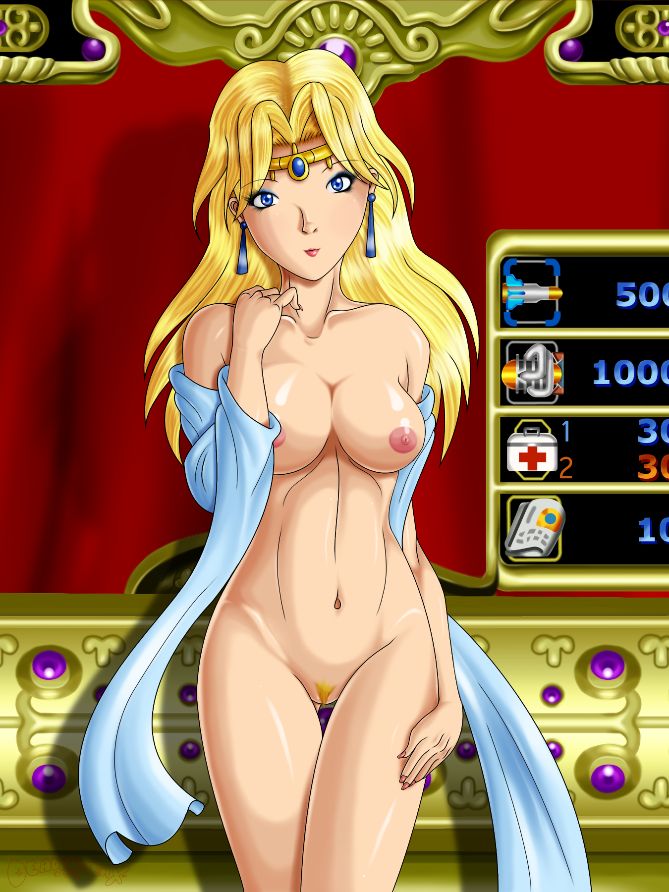
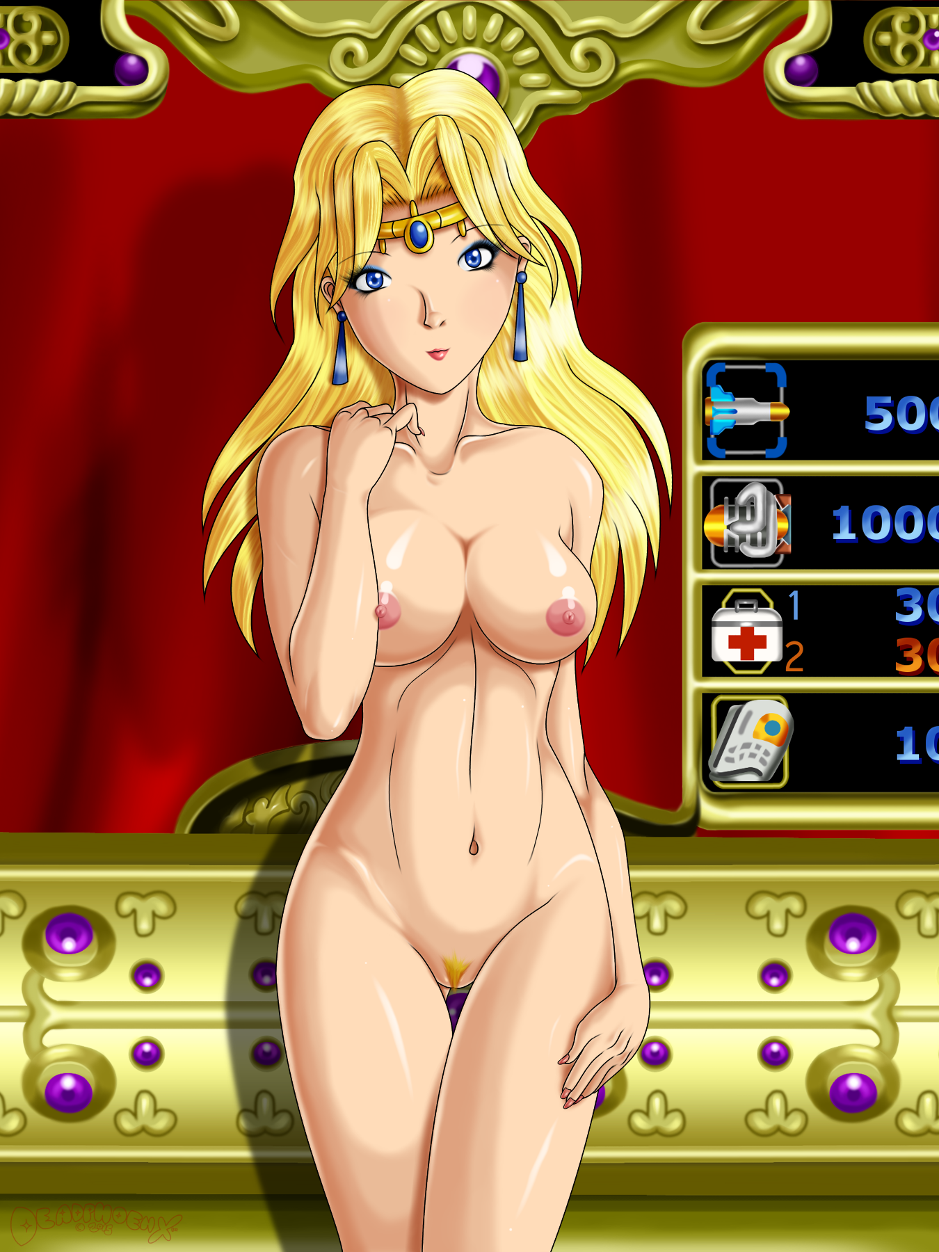
Self Critique: The tug of the dress where her lowered hand is should've been done a different way. I tried so damn much with the wrinkles on the boobs, and I'm still a bit unsatisfied with it. According to some official art of Sylphie, the cloth on her arm wraps around at least twice. I only did it once on the lowered arm. It looks fine, but my OCD says "NO YOU FOOL!"
Note: To read about the process of making the background, check out the widescreen version.
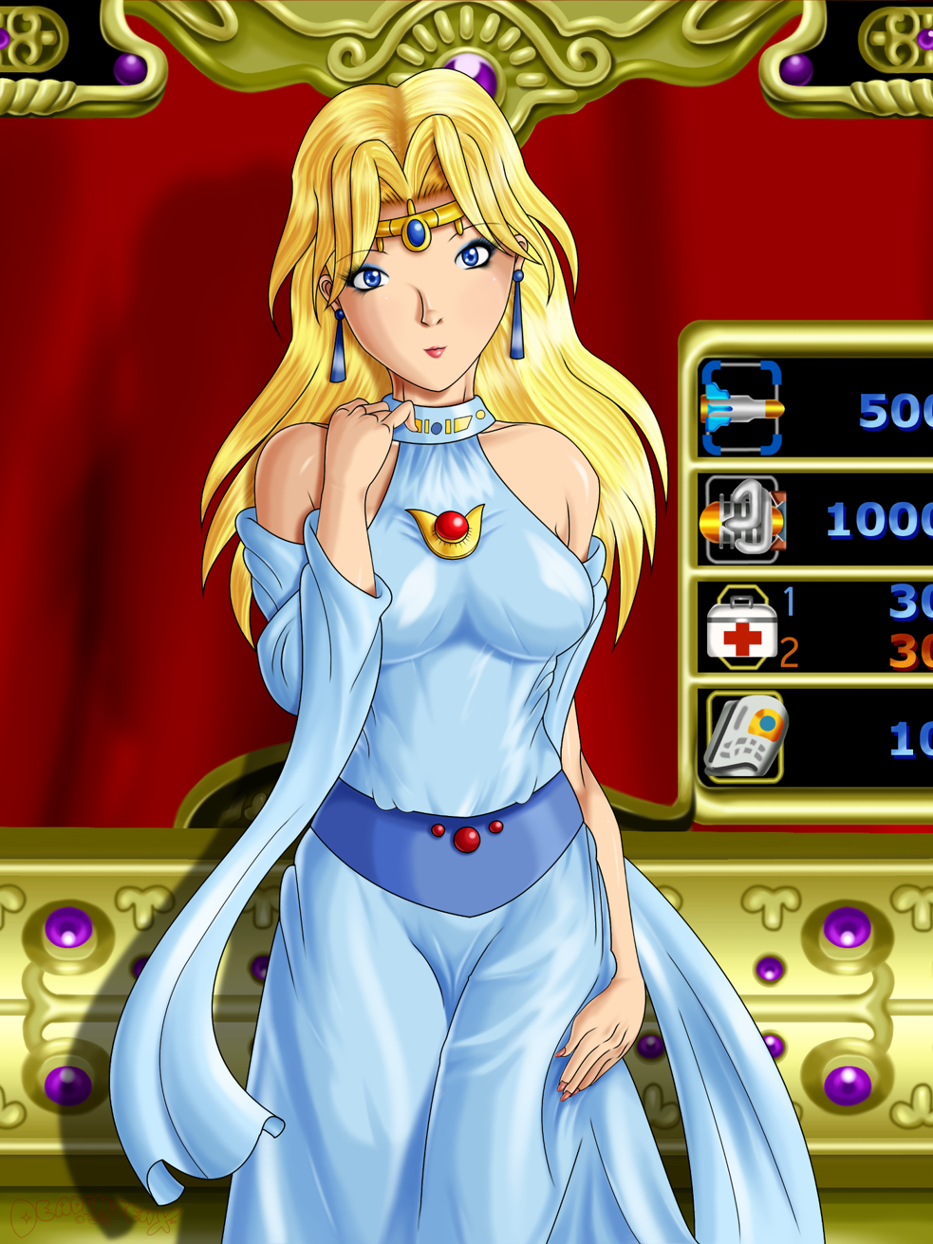
Here's the second shopkeeper of this trio, Sylphie from the Capcom arcade game Forgotten Worlds. She's also appeared in Namco X Capcom and is due to appear in Project X Zone 2. When thinking of which shopkeeper to work on, I got tipped off by an episode of Game Sack (great show btw). So, I had some references to work with, all depicting Sylphie in slightly different ways. There was the Forgotten Worlds arcade art, the in game model, Namco X Capcom, and Project X Zone 2. The major difference between them was the design of the brooch and the headpiece on her forehead. The brooch was based on PXZ2, and the headpiece off NxC. The dress was the same on both crossover games.
Since this was going to have an NSFW version as well, I did that thing I talked about on Kim's pic with color pencils on the sketch phase. The goal for the clothed version was to make the dress cling, and only use color to show off the wrinkles while using very little lineart. The pose reference was off a page I found online from Super Pose Book. While I still don't have the book (and I really want it for art and... reasons), I can tell that it definitely helps. Back to coloring, I had so many problems with her boobs. If you see any official art of her (and few fanart around), you'll see that the top of the dress tugs downward and not to the side. Being the dummy, I didn't account for this and thought I can pull it off after shading it in normally, and tugging the shades vertically. It looked off. I tried again. Still looked off. I spent about 90 minutes doing this, way more time than I should be spending on ANYTHING during the shade process. I realized in the end to use less wrinkles and not more, but I know this can be pulled off with more wrinkles in the future. Fingers crossed.
On the flipside, there's another thing I've been doing with good results: lips with no lineart. The mouth part (you know, the middle where it opens) has lineart, but the lips don't. You've seen me do this beginning with Condado beach but then removed the lineart completely on Sailing Through The Sea. I've treated the lips similar to to how I do nipples lately, giving it its own dedicated layer and painted on top of on subsequent layers, all while using little to no lineart. And this time I took my sketch layer and put it on top so I can follow what I originally drew since I draw the shape of lips better traditionally.
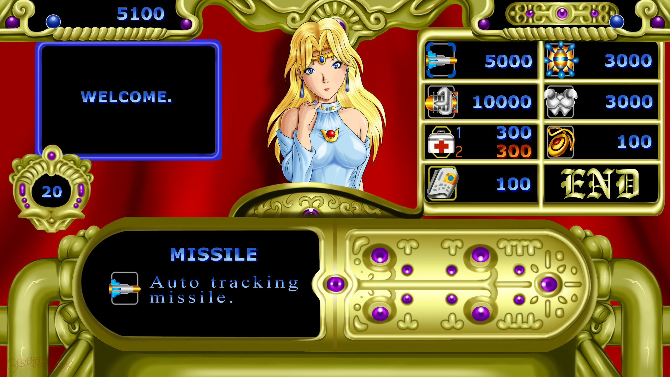
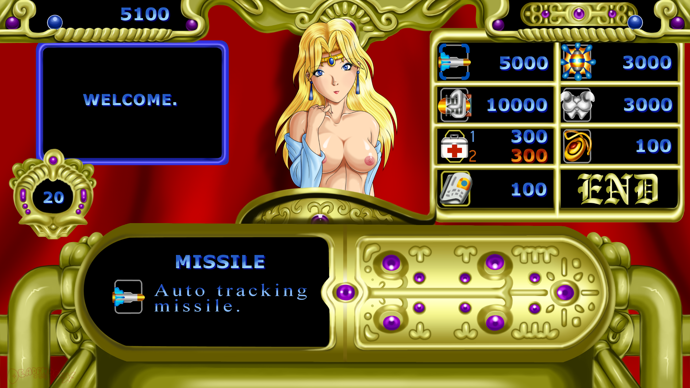
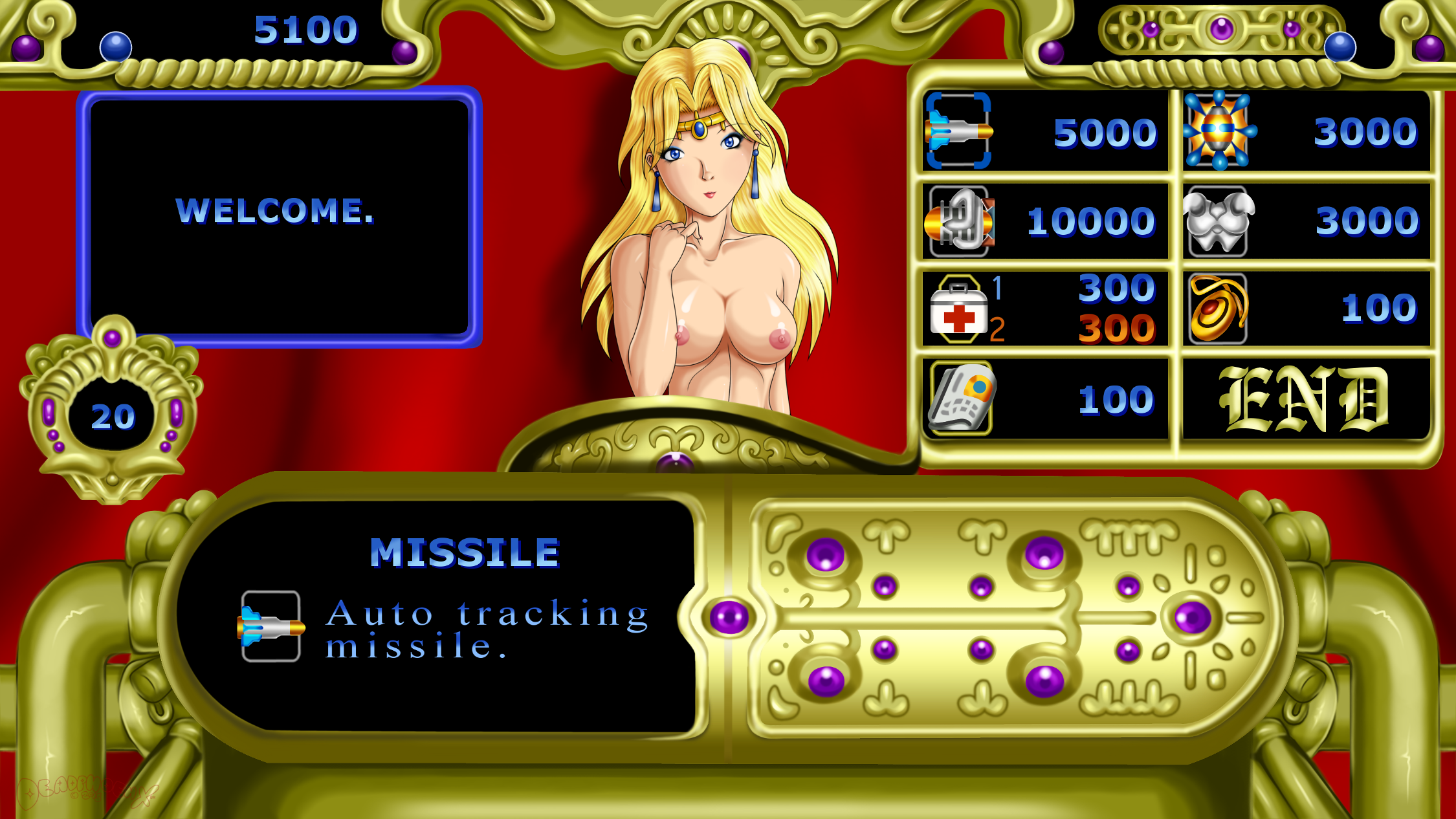
And now we have the widescreen in-game version. There was so, soooooo many things to do, and they were all going to be painted. The initial reference I used was the Genesis/Mega Drive version of Forgotten Worlds. I hadn't realized there was actually a lot more to the shop until I looked up the arcade version. By that point I had already done the player HUDs on top (I only did one of them and duplicated it). I was in a pickle. The colors were more richer and vibrant on the arcade and more washed out on the Gen/MD port. I didn't want to mess up the flow though, so much to my dismay I stuck to the color scheme of the Gen/MD version. what I couldn't ignore was some of the extra things the shop had in the arcade version, like that centerpiece on the top, the timer, and that podium looking thing in front of Sylphie. I was about to do the chandelier that hangs under Player 1, but I was very far into painting everything and was like "fuck it, it's getting covered by a text box. Why bother." I also left out the giant gun that would be behind the text box since it looked out of place. And judging by PXZ2's omission of it, the devs agree.
What I did take a liberty with was the sides of the item description tube. In all versions of the game (plus the version set to appear in Project X Zone 2), the tube ends at each side of the screen. I didn't want to stretch out the tube to fit the widescreen format, and when I made it bigger it ate up half the screen. So I decided to "continue" what the sides of the tube might look like. Since the setting of Forgotten Worlds was post apocalyptic, I'd make just more tubes.
Another liberty I took was with the centerpiece on the top of the screen. When I found the arcade footage, I realized I was boned. The Player HUDs actually had more to it on the sides, pushing them a little more to the middle. Because they were left out in the beginning and I was exhausted by now, there was a lot more space in between both HUDs, and the center HUD seamlessly connected with both. So I had to draw out what it could look like with all this extra space. To be frank, it looks bad. And now that I know a widescreen version exists with PXZ2, it looks worse.
One thing I was doing quite a bit was duplicating and mirroring. When I looked closer at what the original devs had done, that's pretty much all they did. They'd only draw one intricate detail and then duplicate/mirror it. From my understanding, doing something like this saved on time and memory. I like to save time though, so I only duplicated some parts. I did more duplicating on the portrait version than I did here.
Finally, the red background I changed to a large red curtain. I wasn't sure what in the world was going on in the arcade version. And now with the PXZ2 version, I still don't know what's going on. So I made it a curtain to suit the flirty mood.
In the end, I'm very satisfied with the bottom HUD and the pipes on each side. The top HUD, not so much.
Done on GIMP 2.8. Intuos4 tablet used.
Sylphie and Forgotten Worlds are (c) Capcom.
Tags: Forgotten_WorldsCapcomboobshairypussyretro_gamingカプコンおっぱい陰毛


